
Haze
-
Posts
406 -
Joined
-
Last visited
Content Type
Profiles
Forums
Calendar
Everything posted by Haze
-
i agree with dan but i suppose it is none of my business! ok. i really like the one with his eye below the line. i think it just adds something. very purtty ^__^ and that arrow in the second!!!! WOW!!!!!! its so BEAUTIFUL!!! its the shining-star. *winks* i also like the rest of that banner. its lovely. clean pictures. and i rather like the white background, its something new. oh! i hope you dont mind, but i just went through your ENTIRE thread and saved almost all of your stuff to my hard drive. heehee! ^^ i want to look at them lots. i plan on using you as a guideline so that i can better my banner/wallpaper making skills. they are quite low at this point. heh. i hope you dont mind. i wont use them other than to oggle at. k? ~haze
-
heh. cheese. . . .ha. wow. um yeah, so i like the cheese one. its very funny! ^_^ my only problem with is that the text kind of overlaps, so it is hard to read teh bottom line. but very nice. i dont particularly care for the diarrhea one. like Baron said, it seems quite immature. but i suppose teh layout is good, as are the pics. you halo covenant one is ok its just the text where it says "Guess?" ifi had to sum it up in 1 word i would say the text is well,. . . ugly. i dont like it too much. You Naruto one is a bit better. the pictures are blended nicely, though he looks like he is in severe pain. im no big fan of that font, but it is better than the other one. ~haze p.s. sorry, but i want to keep the banner i have currently. well maybe not. try isntant messaging me instead of pming. ill tell you why later.
-
nuh-uh! its not 5! it is a different number.
-
yes you have teh understanding. they retrieved them as tehy passed Venus. now for my new question: how many children did Yukyuzan Anji take care of when he was a priest?
-
heh. word of warning: you probably shouldnt use markers. why you ask? they run, they bleed through and ruin your art, and most importantly, THEY SMEAR! i hate it when i have this gorgeous pic and then it is ruined in one spot because my hand smeared the marker. i prefer three different mediums. the first is colored pencils. yes colored pencils! they come in a variety, and i do mean variety, of colors plus you can vary the darkness with them. you just have to make sure that you go in one direction or else you have one bad colored picture with all the different directions showing. the second is pastels. i dont use them that often, but they do create a very nice look. they do not offer the different range of dark and light like colored pencils do, but they come in tons of colors. the third, and possibly my favorite, is charcoal. *nods* charcoal. it doesnt color in things in color, but i rather like that "shaded in" look they can provide. it helps with shadows, and even looks good to use as an accent when you use pencil. for you, if you are not an art student, the best choice is colored pencils. i hope that helps! oh, and be sure to post your drawings so i can see them! ^__^ ~haze
-
meh, i hate to do this but isnt it right that if someone misses your question your question still stands? well if it is, my question is still unanswered. it was "In Endless Waltz, where do Quatre and tthe Maganacs catch up to the gundams?" Tsukasa_hack got the answer wrong. . . .it was not the sun. that is where they were headed. they actually caught up to it before it was able to reach teh sun. so does mine still stand?
-
eeps!!!! that's really only your first?? it's gorgeous!! but then you make banners already, so its not that big of a leap to wallpapers. very nice cropping. what is that water thing? is it ice, or water? anyway, it looks good. myo ne complaint is the pictures. . . .they don't "match" if you know what i mean. its kindof like putting a tinted pic with a cged pic. but it is alright. keep it up! ~haze
-
hey Baron, where did he Knick that background from? you? anyway i like all of your new stuff! The Halo Covenent one is gorgeous! the picture is good, and the little box things are a nice touch.The Inyuyasha one is amazing as well. teh pictures are perfectly blended. very nice. and the DBD one . .. . . . . that is so beautiful, sad, yet amazingly sweet. i love it to death. i would take it if it wasnt DBD's and if you would let me. it is so. . . .bah! what's the word? Perfect! that's it, Perfect. it sums up Wolfwood's character so nicely, and i dont mean just the quote. everything added together. nice work! The Zelda one is spiffy too! the pics are well blended. NICE WORK! :wink: ~haze
-
i love that banner! it is so pretty. i think i should go see Spirited Away. *sigh* i havent seen it yet. >.< but that banner looks very good. especially the people in the back. they add a nice contrast to the brightness of the girl in front. are they underwater? looks kinda like it. i'm not sure if this is against the rules or not, but you can get good fonts at 1001fonts.com they have oodles of fonts to choose from. try there. it looks good
-
Dagger, Dagger, Dagger. . . .you are amazing. i suppose i can go in order from when i last posted. first off the banner you are using right now is so incredibly beautiful! where did you say that was from? Shamanic Princess? what is that? I disagree with AzureWolf about the banner you made for Arcadia. i thought the picture was beautiful, as is the background. the blackness all over/around her kind of makes her look more erie. That Vampire Princess Miyu is . . . . . . . . . im speechless. i love it so. the red and black just sets her off. nicely done. and your Ah! My Goddess banner. . . . . . .wow. so pretty. who is that girl you used? its very nice. the yellow background is lovely. now comes quite possibly my absolute favorite banner you have done. Chobbits. that pciture is great: great quality, great cropping, great pic. and i like the yellow stuff that is behind the words. what exactly is it back there? but its just gorgeous! your last banner is beautiful as well. i dont think it needs text. let it be one where the person who is looking at it gets what they get from teh pictures. i dont use photo shop so i cannot help you. sowie. i think you are now on my list of greats. fight behind Dan Rugh. who is behind Kaola Sue. so you are #3. congrats! ^__^ keep it up! ~haze
-
that's a banner??!!?? it's alittle big. i resized it to be 500 x 100 and it was really squished. speaking of squished..... if you want o use that picture, i would advise compressing it on a left to right basis in other words, squish it sideways. it is really squished. work on that a little. also i would advise both .h4ck and Masscre to try and lengthen your posts. .h4ck could probably be counted as spam. so watch out. nice try on your banner though. keep it up
-
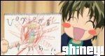
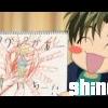
while the artwork is quite good. . . WHAT IN THE WORLD?!?!?!?!?!? you got any words to go with it? i dont understand what it is supposed to be. . . .but that isnt why you posted is it? i like you artwork. very pretty. and i like those eyes in the second frame. very pretty. nice work. ~haze
-
i love that! even more so than the banditos! did you customize those shapes? thought so. the green dots (while the green is ugly) add a little extra to it. and the quote and box around it is nice. where in the world did you come up with that?
-
very nice! if you had some better pencils, i would be taken aback. but it is still nice. everything underwater is quite good, but every thing above. . . .well its not so good. like what is that big blob of brown, red, adn orange that is kindof in teh top middle? is that a volcano? if it is you might wanna practice with those. but if its not. . .. well you might want to practice with whatever it is supposed to be. i really like the woman with the dolphin. they came out great! keep it up ~haze
-
what are you talking about? i think that it is hilarious! not to mention good, as always. true the artwork is not gorgeous but all together the banner looks great. for my info, what are pink-eye banditos? they are quite funny looking. ^__^ but kind of cute! ^__^ very nice baron. very nice. keep it up ~haze
-
meh, i like that last one's font. who is that girl? and where in the world did you find that photo? also how did you make it (if you did) look like it was painted? ah, so many questions that i may as well throw this one at you: what program do you use? i think the font kindof goes with the pic. the first. . ... . . . . . . . . . . . i dont know if i want to comment. yes i do. that is hilarious! dthe picture is of good quality, as was the last. but as you said, the text sucks. it doesnt "flow" with the rest of the banner. very nice :) ~haze
-
[COLOR=crimson]alrighty folks! i am in desperate need of all you banner/wallpaper makers out there. so i made this wallpaper, a kingdom hearts one to be exact , but i need some words. i dont care if its a quote, poem, etc. its just whatever you feel goes with the paper. i would ask that you posted since this way i will get to thank you, while i cannot through pming (my parental controls are stupid once more :(). many many thanks. so here's the wallpaper.[/COLOR] EDIT: i also have a paper that is the same as that one except i added one of the artistic borders from Paintshop to it. i dont know if i like it as well as i like the original. if someone else will post i can post it to see if you like it.
-
ok, since no one has answered i think i will give it a go. in the Endless Waltz saga, at which planet do Quatre and the Maganacs catch up to the gundams?
-
dont worry, mine did it too. i cant wait to see this angel. sounds interesting. ^^
-
 well you asked for our criticism so dont complain when you get what you want. if you dont want criticism, dont post your stuff on the boards. anyway, i like this one. its just that the picture is a litlle too stretched from side to side. but i like the squiglly-doos on the background. very pretty. just for my information, what program do you use? that one looked kind of like a paint banner, but its probably not. ~haze
 -
firsties! ahhhhh!! that's my song!! that has got to be the best song, no? but i really like your wallpaper. just one thing; the text is really hard to read. i would suggest changing fonts but that is my opinion. what are those dark splotches up there by riku? whatever they are they seem a tad bit out of place. very nice job! ~haze
-
i agree that your banner are getting a bit better. this one still has the problem the rest have. . . text. 1. that font does not go with your banner. it makes the font look ugly when compared to that picture and it also degrades the picture. 2. color. i get that you are trying to "tie in" the text color to the picture. but please dont use the same color text as the picture. it makes it so hard to read. as i have said before you want your text to yell at the top of its little word-lungs "LOOK AT ME!!! I NEED TO BE READ!!!" i hope that makes sense. but i do like the pic you used, though i would clean it up. but i agree that you have come a little bit further along in your skills. keep it up! :) ~haze
-
awesomeness! i'm lovin that last one. is that a color around that guy's neck? hmmm. . . ok. i think it looks good with that tiny black border. is that the border you are talking about? honestly i dont like the cloud banner. the pictures look like two different people, the left one looks like a woman and the right looks like a man. i really do like that effect, what was it? that fading thing? i would like it if the pictures looked like the same guy. i think if you found a new left picture and replaced that one that's there it would be killer. now for that grey banner. i really like that. though i agree with terra that you should try to keep her facial area clear. but all else is good. i like the look on her face. kind of remembering yet sad. quite nice. keep up the coolness, eh? ~haze
-
really? i don't particuraly care for At The Drive-In. i'm not sure why, i just dont. have you ever heard of Moving Units? they are not really all that similar to The Mars Volta. i think they are much better. try them out and tell me what you think.
-
wow. that is kind of neat. i love those boxes of color! it is really a good design idea. how in the world did you do that? now that i really look at it. . . .it is so neat!! indeed yo are a skilled designer! never say you arent. beautimus. ~haze