
Haze
-
Posts
406 -
Joined
-
Last visited
Content Type
Profiles
Forums
Calendar
Everything posted by Haze
-
I like it. I absolutly love the background with all of the "smudges" and stuff. The sludge, as Shin put it, looks great too. My only problem is that I don't really like the font. I love how parts are kind of whipped away, it's just kind of hard to read. When I first looked, I thought it said "Fainful Memories." And it obviously is not that. No real problem though. Since this is my first time to post in here and all, (still can't believe that) I figure I will tell you what my favorite banner is. It would definitely be the shinji-gendou-noir one. I love the black and whiteness and how Shinji is in a whiter stripe. My only problem would be that it has no border. >__< But it is excellent work all the same. Great work here. Your awesomeness is shown all throughout this thread. Keep it up.
-
*big smile* Thank you Baron. I really like that one. It was originally a black background with white and grey lines. Then I made the two people kind of blue. But I didn't like it that much. So I just messed around a bit and decided to do this. I'm glad you like it. So here is another banner. For some reason I am back in "banner mode." *shrugs* Don't know why. But this is my latest creation. I used the same picture that Kitty supplied in her request thread. I liked the picture. Don't know if I will use it though....I might....I might not. Depends on the reaction. ^__^ -haze
-
I think they are pretty good considering you are using Paint. My first comment will be to let you in on a little secret....*whispers* there is a way to get that ugly backgorund box off of your text. Yup! All you have to do is click on the little box that has no fill (this little box I am talking about is under where all of the tools are. It pops up once you click on text. It is the option on the bottom with the shapes and no white behind them.) Also I think you might be able to get some better pictures. It may just be Paint messing with your pictures, though. I cannot wait until you move on to Photodraw. Paint is evilness in the extreme. But you are doing good with what you have. I hope to see more soon! -haze
-
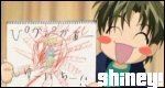
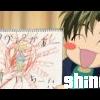
O.O When I first read the title, I was coming in here looking for lots of blood and guts and such. Heh. Silly me. I like it. The picture is funny. The text is good. I like how you made just the "S" red. Adds a bit of blood colors in their. But I must say, I am not quite sure why their are arrows and plus signs in the background. They don't look bad, just a tad bit out of place. There isn't really anything I think you could improve....maybe something will come to me later. Heh. That look on the chicken's face is hilarious. Are you a vegan or did you just come up with this for the picture? -haze P.S. Did someone try to use your banner, or did you just put that ("Please, don't use it, it is only here for display") for some other reason?
-
NOOOOOOOOOOOOOOOOOOOO!!!!!!! I must save my thread!!! *cough cough* It wasn't my doing to put them on air. THey had absolutely nothing under them, and everything I tried to put underthem didn't look too great. Thank you for the wonderful comments!! So this next one is kind-of good. It is really really plain. I used a simple black background with some of those line things. Then I put the picture of the war cat and that same guy from "rawr" on it. I think it turned out pretty well once I put it in Sephia Tones. You tell me if I did well. -haze
-
My advice for pictures is to go on Google Images and search. You just have to go through all of the crap. It is much better than Yahoo searches for images. It has this lovely little feature at the end of the list about adding in omitted pictures. Good stuff. Just go to google and click the Images tab. THen you are set.
-
YAY!!! *dances round* Thanks much Baron. I am working on the matching avi. It will probably take a while. You must explain this "bit of spice." I'm not sure what you mean. What is wrong with my H?? It is a fancy H. I know that my cropping on "rawr" wasn't the best. Like I said, I did it by hand. And I don't even want to talk about the "Ring" one. >_< This next one I thought I did kindof good on. I love teh colors in the image of the girls! Very pretty colors. So I took colors that were in where their legs are colored and created teh background. Not the most creative thing, but I think it turned out alright. So obviously it is from Beatmania I I DX. I have no clue what that is, but the girls are cool looking. -haze P.S. I just want to reiterate how much I appreciate all of your comments. Contrary to popular belief, I actually do take most all of your sugestions and use them, at least those that make sense. I am extremely thankful to all of you who have posted here, good or bad commentes. Many many thanks.
-
Simple and Clean as always PT. I agree with Azure that it doesn't need a period. Looks good though. THe style is reminiscent of Nintendo. Fun stuff.
-
Yes my version of PSP does have the "wand tool." I just don't know how to use it. >_< It took about an hour to do all of the cropping. While we were in that chat the other night, I worked on it. I went around the entire picture and hand erased the parts that didn't need to be there. It left me with blurry vision and a hurting hand....I had to magnify it all the way to 700%....try working like that for several hours at a time....not good. I liked my last banner too. ^__^ I got the picture of this rather larger ball of light in a field with lightening coming out all around it. So I took part of it and did a "softer than solarize" thing that paintshop has. Very neat little effect. It just inverts all of the colors. And just so you know CrH, I detest large quantities of orange as well. But I needed something "firey" but not so much so that it would not fit with the picture. So I took light oranges and yellows to make the background. Didn't really do much to it though. I just distorted it greatly. Now for my next thing. It is another banner. I thought that since I got my new name (woot woot!) I needed a new banner. And I had this picture laying around of two girls with black hair and in red and white dresses on a white background. And I loved the general scheme of things so I took part of it, changed it a bit, and smacked my name on it. I like it lots though. It reminds me of the White Stripes new CD "Elephant." But I have always called elephants "elephantes" so that is what I named it. Can't really tell there is a difference to it when it is written, but you can when I say it. Anyways, tell me what you think. P.S. Baron, I don't see a post from you yet.
-
Whoa. SImple as that....whoa! VERY nice work here Azure. Kind of OOC for Lain, but still really good. I was able to scrounge up two gripes though. The black outline that is around Lain. Sometimes it is there, other times it isn't. You need to either fix that to where it is fully around her, or get rid of it. Kind of distracting, especially where it leaves at teh top of her head. My second one is the clouds. You need them there, but they aren't the best in the world. Did you draw them yourself? It isn't that they are horribley ugly. It is that they don't look....I guess you might say "fluffy" enough. CLouds are fluffy, and yours....aren't. I do like how you made the ones on the bottom have depth though. It is just the edges on them that I donot like. So now that I have made my gripes, I will say all of the many many things I love about it. For starters the colors are amazingly good. I'm not sure I have ever seen an anime wallpaper with so much color and vivacity, much less a Lain wallpaper like that. I like the "angel wings" around Lain, but I think they look more like flower petals. But they look perfect the way they are so don't change them at all. I disagree with Hittokiri about the lines at the top and bottom. I like them. And your little sig thing on the bottom.....so cool. I love the kanji (I'm assuming) behind your name. Good stuff. This is better than my second wallpaper, by far. Mine was....*shudder*.....uglyness in the extreme. But yours is simply gorgeous. Keep it up! -haze
-
Art Simple yet sophisticated Fruits Basket Banners
Haze replied to DragonofDestiny's topic in Creative Works
I kindof like it. There are a few problems with it though. For starters that font. I can't read it at all. Secondly, you missed some places on your cropping. There are places around their hair and face that still have pink, light blue, blue, and purple every where. I could see why you would leave in the purple umbrella part on the left, but it just doesn't look right. Did you do the background yourself? It looks neat. Good work. Just fix those 2 things and that will be a spectacular banner. -haze -
Thank you, Shizoku. You too, Azure. To answer your question on how I crop will be difficult. I don't know if you use Paintshop Pro 8 so I don't know if you will know what I am talking about. There is a tool on there called 'Background Eraser.' That is what I use. It pretty much just takes what it thinks is the background, and under your control erases it. It is just like using the pencil thing on Paint or anything like that, except it erases. Quite nifty. Anyways, I do not know how to crop on Paintshop Pro. All I have seen is that you can crop in boxes and only in boxes. I have looked everywhere for a way to crop not in boxes, but my search has got zero results. I have even checked the 1,000 page User Guide. So I still use the Background Eraser until someone can tell me otherwise. *looks around for someone who uses PSP* Anyways, I fixed what you were talking about Shizoku. For some reason when I resized it after I put a border in, it cut off part of the bottom. *shrug* So no one replied to the banner I posted. I decided to put up this wallpaper I just made. I was told how to make layers transparent so I put like 8 layers on the background. It made for one odd shade of orange. Then I put a layer of yellow on top. I rather like it. I didn't do anything to teh picture other than cropping. I didn't put any text because I don't know who the guy is. I don't even know what he is from. Wait.... His name is Roku, or at least that is what the original picture saved itself as. ^__^ If you have any ideas what I should do for my text problem, let me know. I have no clue what to put.... -Haze P.S. I believe, Baron, you owe me a post. *nods* So get to posting.
-
I think the 06 is a part of the background of numbers. Is that right? Anyways, I really like that. The picture is well cropped. Very well cropped. So props for that. I love the right side of the banner. It is amazingly cool. I like the slashes of light and the light that is all around them. It is like cuts in the background and light is flooding in. I think it needs a bit of text though. Maybe a cursive "Kaisuke" or maybe even not cursive. Just put some text on it to balance out the picture. I think it would go best on the right towards the bottom. Once again, awesome work. ^__^ -haze
-
Honestly, I like the kanji as red. With it red like that, it creates a bit of contrast between it and the background. While at the same time, it blends sort of into the background. Kind of makes it slightly noticable, and doesn't draw attention to itself. Once again I must stress how awesome this is!! ^__^ It really is great work. I'm not sure how in the world I spotted the whiteness earlier. Sharp eyes I suppose. But I love it. Mind if I put it on my desktop? Hope to see more....lots more. -haze P.S. to answer your question in teh other thread, no I don't have deviantART. I wish I did, but alas. I do not. >_< I'm trying to see if I can get it. P.S.S. Where did you get the original image for that?
-
Thanks much! Usually for cropping, I use the background eraser. That is why in my works, I usually have debri left over around my pictures. There is no wonder I couldn't find how to do transparency. ^__^ Once again thank you so much!! -haze
-
So this thread is for those who have PSP. OR even if you don't have it, but would like to contribute something. *NOTE---Syk I put this here because it is Art related. I'm sorry if it is in the wrong place. If it is, I am really sorry for the inconvenience for the moving of the thread.---*END NOTE* So I just aquired a copy of the Paint Shop Pro 8 program. Actually it was more like months ago when I got it, but that isn't the point. I have been piddling around with it lots, but I don't actually know what I am doing. I just had a few questions for anyone who uses v8 or any other version. 1. Is there any way at all to crop without using a box? I mean with circles, triangles, or free crop or something. 2. Is there a way to make things transparent? Things like images. I have been all through the rather large book and have found nothing. I thought perhaps I had missed something. 3. Do you have any words of wisdom for me? Any useful tips? Anything at all? I hope at least one person will help me out here. I really would like to know the answers to my questions. There are so many people that can do cool stuff with PSP. I would ask one of them to teach me a bit of their ways with the answers to these questions. Pwetty pwease? *pitiful face* ~haze
-
Hmph. I am here. Are you happy? ^__^ This is not my favorite one of yours, but I do like it. Although I must say the yellow is refreshing. I like how you added the american flag thing. Very original. The main thing I do not like is the text. It just doesn't fit very well. Also the very large black splotch seems out of place. It does look quite good though. Overall that is. Nice work, as it always is Baron. ~haze E D I T: *hangs head in shame* oops. I looked at the very first one you posted. Silly me. I kind of like this one but I kind of don't. With the eyes like they are It is a tad bit destracting. Yet cool looking at the same time. I like the machenery look....or what ever that is. I still don't like the text. Change the color or something. Better yet change fonts. That one is not very high on my list of lovely fonts. Is that an eye? What exactly is it that you put on there? What ever it is, I like how you aligned the big black spot into the center of the "eye" part of the new thing. I like this one better than the other. And yes I realized how I skipped around a bit on the comments. I think I put in all I wanted to say....
-
Great work! I love that you started (or restarted...i don't know which) making wallpapers. THey are really good. You will have to bear with me on these comments. I have never seen Naruto. Just some problems I have with this one: 1. The picture of the guy in orange isn't of the best quality. Slightly blurry. And as we all know blurry=not good. 2. Those boxes around each character. They all seem to be different sizes. Without Looking at it full size, the ones around teh chick and the green guy look nonexistant on most of the sides. When I do zoom in, I can see that they are there, just smaller. THe blue guys box looks to be a pixel or more wider. And I know you say....Phft! One pixel! But You really can tell. I wouldn't lie to you. 3. I absolutley do NOT like the fact that you can see someone else's head in the same picture as the girl. Doing the "keep the original backgrounds" thing is cool. Just not that I can see somebody else's head. Not cool. I would suggest a new picture. 4. Yet another shamelessly small detail, but you messed up a bit on a spot of coloring. If you look at it, I think you will know what I am talking about. Once you know what I am talking about. ^__^ Look at the blue guy's box. Now look at the bottom right- hand corner. Just outside of the box, you can see a white run. Almost as if you were coloring over it, but ....didn't. And while we are talking about the blue dude. His upper left hand corner has no background. It is just black. *shrugs* Just the tiny itsy, bitsy, small details I caught. Don't mind the nit-picking. I just feel like taking stuff apart today. DOn't mean to sound rude or anything like that. Just helpful.
-
you did this? All alone? No professional help? OH MY LORD!! O.O That is amazing. It really is. That border is like...whoa. LOL. It is very pretty with all of the butterflies. I love the fact that you made the curtains sheer. I do have a few problems with it though. First off...that arm. It isn't very proportional, unless I am seeing things again. Also that foot and the pants leg look a bit odd. The foot on the left doesn't look right. It is like the bridge of the foot continues to go up the leg. I'm not sure if you will get what I am saying. I'm not even sure I get what I am saying. But it looks really gooooood. Those are beastly books.....just my type. heh. I haven't ever seen you here before so I will say....I hope to see more of you excellent work. -haze
-
*thanks God someone finally was able to start a thread like this* I have been waiting for something like this. It happens to me all of the time. Like my current thread: 21 replies, viewed 265. How can so many people look at the stuff then not comment? It makes you feel very underappreciated. I have never been one for the useless comments so when I am saying good job, I say everything I like about the stuff. And usually after I keep looking back I can find some minor flaw that will help them. Or even if I don't find a flaw or two, the people still know what their strengths are so they can do it again and make good stuff. Sasuke, I hate doing that. It just makes me mad that so many people would download it and just not bother. It is a waste, in my opinion, to post it and get a few looks but no posts. I think we need some posts here. I mean, if you look at somebody's work and you took the time to look, why not take the time to post a simple reply as to why you did/did not like it. Not that hard. heh. I might post more later. I'm gonna be late for school if I keep at it. >_< -haze P.S. Kinetic, I like that. [I]Each and every piece, as I said, has strengths and weaknesses[/I] Sounds like a fortune cookie. O.o
-
That is really cool. I love teh background effect you did with the red streak things. Clean cropping too. Although it seems like there is a rim of white around his hair. I'm not sure because I just woke up so my eyes are a little bleh, but I am pretty sure. It is a very very small rim though. It really does look great. What program is that that you use? What is this "airbrushing?" I feel ashamed that I have no clue what it is and how to do it. >_< Also devianART is working now. So we can see it in all its glory. Nice work.
-
wow. That is.....odd. Very humorous though. I like it alot. I might suggest that in some places you might want to change things a bit because I found myself stumbling along in certain parts. It became difficult to read and keep up with what was going on. Just my thoughts though. Nice work. I like the ending, although I don't see how it fits.
-
huh. Well, those lyrics are nice. Rather abrubt. ^__^ I'm not certain they really go with the banner though. Nice cropping with the gundam. One of the problems I have with this is that effect. Maybe if you took it off of the gundam it would be good. It just makes the gundam look kind of bad. Also I'm not really liking that font. It is just too simple for my tastes. Nice job though. I hope to see more.
-
Much better. I must say this one is probably perfect. It looks like the bottom of the forground picture has a bit of a glow on it. It may just be me. But this one is everything good I said on the one before....Stupendous....Awesome...Great....Lovely....pick one. ^__^
-
[FONT=century gothic][COLOR=orange]Hey you! Haven't been here in forever, have you? LOL. It's nice to see you come back with such a great piece. I absolutly love the background! That effect is great. What is it called? Whatever it is it adds so much to the piece as a whole. The whiteness around the text could stand to be reduced. It draws your attention immediatly to it, and I don't think it is really all that important. The picture to the left is good as well. Just one problem. His hair above his right shoulder looks like it still has the original background behind it. I see blue. So just fix that and it will pretty much be flawless. Also you may want to fix the tiny problem that he is slightly blurred. I must say that this is by far one of your best. Lovely work. I hope you will post more of your excellence. ~_^ [/FONT][/color]