
Haze
-
Posts
406 -
Joined
-
Last visited
Content Type
Profiles
Forums
Calendar
Everything posted by Haze
-
I beg to differ with you. I think the format is good for something like this. It is a tale of adventure that probably won't be that conventional so it needs something different. The descriptions were amazing. I love how you slowly described Leo and his surroundings. [I]The snow was as soft as cotton wool but colder than ice, appealing and yet lethal, like a serpent under a flower.[/I] That has to be my favorite part. It is so...descriptive I guess. It really paints a picture of something as simple as snow to be as deadly as anything. Very nice work. I hope to read more. haze
-
LOL. I like it. It is kinda pretty. I love the border and how it crosses to finish up in the top left. I think the picture of Kagome on the right is a bit blurry. Could just be the particular dress she is in. Why didn't you make this into a greeting card????? That is what you usually do. But it is nice to see your banners for a change. ^__^ Very lovely background as well. Nice job! ~haze
-
heh. I think the idea is a really good one. Sounds like, if you do it right, it will be very interesting. Perhaps if you added which character you are using at the beginning of each chapter or break. You know, like at the beginning of this chapter put 'Character A' right after the chapter title/number. Then once you are done with that characters point of view, switch to a new chapter or add in a break (and by break I mean like pushing enter 5 or 6 times), but don't forget to add in the character name. I hope that made sense. I just have a problem with this part of the story. Goes a bit like this: [QUOTE]?Do you think she knows?? The five year old looked toward the woman in question, in this case their mother. She was hanging out the weekly washing and battling the wind at the same time. It was unseasonably windy for summer, and the hot breeze did nothing to alleviate the sweltering Australian temperatures. ?Nah,? replied his brother, Tom. ?I don?t reckon she has a clue.? He swiped their hair away from his face in an absent gesture, one typical of his personality. His hair?Do you think she knows?? The five year old looked toward the woman in question, in this case their mother. She was hanging out the weekly washing and battling the wind at the same time. It was unseasonably windy for summer, and the hot breeze did nothing to alleviate the sweltering Australian temperatures. ?Nah,? replied his brother, Tom. ?I don?t reckon she has a clue.? He swiped their hair away from his face in an absent gesture, one typical of his personality. His hair was a nondescript brown, thick enough to stick in every direction. His face was sweat streaked and flushed. His eyes followed the figure of his mother. [/QUOTE] Do you see what I am talking about yet? It restarts itself. Almost as if you started and then forgot you did and started again. I'm sure you will fix it though. ^__^ I really like the descriptiveness that you employ. I can pretty much imagine the boys (although I would like to see a bit more of their descriptions, though not so much that it would take anything from the story. Maybe just how old they are and a couple of more things about their looks.) and the wrapped present. I love how you created the image of the present. It would be just like 2 little boys to wrap it like that. ^__^ Also you do a good job with the mother's description. You go into great detail without going of on a tangent or disrupting the flow of the story. Just one question. How is it the mother's birthday if she only has "23-and-a-half years?" Would it not make it her half-birthday or something? Just checking. I hope to read more.
-
[QUOTE][I]Originally posted by White Mage:[/I] Choppy cropping my friend. I'm not sure if this is supose to be a wallpaper or not but it just looks ecky. If your using MS paint, it would make since but if your using somthing different then whoa, You need to practice more then. A black background with stars isnt apealing ethier. What went wrong?[/QUOTE] I thought the object of putting things up was for constructive critism. Do tell me what I need to practice more on rather than just saying I need to practice more. And why isn't a black background with stars 'not apealing?' I don't know how to fix things if you can't tell me what exactly I should fix. And no, I do not use MS Paint. In fact, I think it quite an insult that you would say that. For your information, I use Paint Shop Pro 8, which I am pretty sure I already said. If not, then you know now. I also found the 'what went wrong?' very insulting. No body else had a problem with my stuff. So why do you? ~Haze P.S. I will post something else later. I am just a little bit angry right now. EDIT: Ok, still mad, but I will post something. How's about a banner? Haven't made one of those is forever and a day. This is one I put together this morning at like 1 A.M. I have a bunch of pictures saved and I found this one somebody did as a wallpaper. It was of a sun and lightening. So I cut out this part and changed it around a bit. the rest of the quote was supposed to say. . . 'I'll be there...when the darkness comes.' But I like it when it just said 'I'll be there.' So I left it like it was. I hope this is more up to your standards White Mage. :smirk:
-
I agree completely Baron. Teh text does not do justice to the banner at all. And what a lovely banner it is! I really like the picture you used. It is crisp and very, very well cropped. I also like the background that is [I]behind[/I] the letters and numbers. I do agree with Baron that the glow around everything but the cross should go. It all makes for a really pretty banner. Good Work! ~haze
-
this is from an anime I now know is called El Hazard. I think. O.o BUt yeah. I made the bakcground once again. I thought the star like feel would go well with the ring of grils. And before anyone else states it, the purple portion of the ring is messed up. Don't know why. It just happened that way. But I think it looks alright. I hope you do too. ~haze
-
thank ya. This next one is blue. And I do mean blue. I was looking around a bit today, and I came across this really cool Bebop wallpaper. I loved the quote so I decided to use it. And here it is! I used lots and lots and lots of bright blues. It is pretty basic, but I still like it. I hooked Spike onto it since I have been trying to come up with some way to use the picture that I used here. Hope you like. ~haze
-
wow. Those are great. I like the first one better. That eye just looks incredibly cool. But I must say that I like the toolbar thing from the second one better. I amazed that you can do stuff like that to a myOtaku site. Really really nice work. ~haze
-
[size=1]Cuteness does not even cover it. That is really a great banner in all aspects. It's cute, pretty, the text fits well, the border is nice, the pictures are nicely cropped, and all of that makes for one spiffy banner. Nice work! heh. . . . the cuteness scares me.. . . no really. ~haze[/size]
-
[color=firebrick][size=1]Solo, that is the best!! I just sat here and read the entire thing. I am amazed at the details that you came up with. I can see exactly what you mean when you describe something. Great work! I think you got a lot of the characters' personalities just right. The only thing that might make it better would be if you added in a bit more description of the characters. I know that you provided a list of who was using which avi, but you also said in the first part of the story that each one was different. Ya' know, there were different colored ones and a lot of them looked kind of different. That last part was soooo funny! I want a cute little mini-Haze. That would be the best. They seem so adorable. And the fight between mini-Ken and mini-Flash was so cute! This is probably the best thing I have read in here in a long time. Great Work! I can't wait to see what might happen next. ~Haze[/color][/size]
-
It is pretty good. I agree with what CrH said. Also may I add that the red color of the text takes a bit away from it. I don't think you neccessarily have to change the font, just the color. Also I don't really know if the gargoyle and diamonds really fit in with the theme you were going for. What did you get those pictures from? Mayhap if you rmoved everything outside of the oval, you could keep it. ~Haze
-
[FONT=century gothic][COLOR=firebrick]General Awards Overall Member of the Year: Syk3 Honorable Mention: Shy Male Otaku of the Year: Syk3 Honorable Mention: Charles Female Otaku of the Year: Dagger IX1 Honorable Mention: Raiha Staff Member of the Year: Syk3 Honorable Mention: Mitch Funniest Member: Poisontongue Honorable Mention: Dragon Warrior Most Opinionated Otaku: Poisontongue Honorable Mention: Qukey -__- Member most likely to be here in two years: Adam of course! Honorable Mention: James. Absolutely canNOT go without James. Best Newbie: Dagger IX1 Honorable Mention: Arcadia Best Oldie: Shy Honorable Mention: Charles Most likely to become a Staff Member: Baron Samedi Honorable Mention: Dagger IX1 Favorite Banned Member: bloodsin Honorable Mention: Tical (but of course he just [i]had[/I] to come back) Most improved Member of the Year:-- Honorable Mention:-- Thread of the Year: Daily Poem Silliest Thread of the Year: I......am Lone..... Honorable Mention: What are you thankful for A-Z Random Awards Avatar Award: Charles Honorable Mention: Semjaza Azazel Signature Award: Syk3 Honorable Mention: Semjaza Azazel (his current one is the best) Best Location: Mitch--"crucified" Best Otaku Couple:Syk3 & Mei Honorable Mention: Piro & Asuka Best looking Otaku: Juuthena Otaku clique of the Year: Adam's Angels Best MyOtaku: Charles Otaku Writers Poet Laureate: Raiha Honorable Mention: Mitch Writer of the Year: Shy Honorable Mention: James (for the both of you, the details and stuff you guys added into 'Kill Adam' was amazing.) Orginal Story of the Year:'Otaku Boards: Enter the Net' Honorable Mention: Role-Player of the Year:-- Honorable Mention: Brawler of the Year (sparring): -- Honorable Mention:-- Role-Playing Game of the Year: Kill Adam Social Otakus Otaku Social member of the year: me. i don't know. Honorable Mention: Entertainment Otaku of the Year: Dragon Warrior Honorable Mention: Poisontongue Anime Otakus Otaku of the Year: maladjusted .hack//SIGN Member of the Year:-- Honorable Mention:-- DragonBall Guru:-- Honorable Mention:-- Digipeep of the Year:-- Honorable Mention:-- Gundam Member of the Year: -- Honorable Mention:-- Yu-Gi-Oh Member of the Year:-- Honorable Mention:-- Least Disappointing Yu Yu Hakusho Member:-- Honorable Mention:-- Otaku Gamers Gamer of the Year: -- Honorable Mention:-- Nintendo "Mario" Award: Shinmaru Honorable Mention:-- The Sony Award:-- Honorable Mention:-- Xbox Gamer of the Year:-- Honorable Mention:-- PC Gamer of the Year:-- Honorable Mention:-- Otaku Artists Best Graphic Designer : Dan Rugh Honorable Mention: Baron Samedi Best "Traditional" Artist : Sara Honorable Mention: Queen Asuka Best Spriter: Dragonballzman Honorable Mention:-- Series Otakus Series Otaku Member of the Year: Honorable Mention: Square/Enix Member of the Year: Honorable Mention: PokéPlaque (Pokemon): Honorable Mention: The Triforce Award (Zelda): Honorable Mention: Because of this right here, I just realized that I need to leave the art/design forum more often. Seriously. I never go anywhere but there, poetry, and the occasional trek to the Anime Lounge. Congrats to all that get voted for. [/FONT][/COLOR]
-
Writing Today's Poem [M -- As a Precaution]
Haze replied to Heaven's Cloud's topic in Creative Works
down here under the stars i feel free and completely undone. never having to do anything but sit and wait for them to take me home. back home to space where my life will be complete. how i long to be up there once more, back in the home i once knew. they know what i am. they know who i am. never have to say a word simply live and die beside the stars i love. -
Roll!!!! I love her!! Perfection, Shippo. I absolutly love the squgglies that are on either side of the banner. How did you do that? I love the texture effect that you put on there. It looks amazing. I only have a slight problem with the text. Can you see the break in the 'R'? The top is grey and the bottom is black. Other than that itsy-bitsy detail it is perfect. ^__^ Keep it up. ~Haze P.S. I absolutly love your sig banner. LOL!
-
this afternoon when I read your post, I thought this would be the easiest wallpaper I have ever made. That was at 2:35. It is now 8:47. So that makes me 5 hours on a wallpaper and all I have to show for it is cramped knees, a splitting headache, and one very pretty wallpaper. I didn't use the picture you gave me because I couldn't think of a way to incorporate it into a wallpaper. The trees screwed me over. So I decided to do this idea that I have been meaning to try out. And voila! Here it is. And before you say it, yes it is yellow. Bright yellow. I thought it would look good. I don't like it yellow, but I can't change it now. To put all of the girls' pictures on there I had to cut them out individualy and put them in a hexagon. Then I had to [I]hand-color[/I] the area that did not fit into the hexagon. I also hand-colored the backgrounds behind each girl. So if they look a little shabby, forgive me. I tried the hardest I ever have on this paper. So if you don't like it, I still like it. I said I don't like the yellow all that much, but after I put it on my desktop I kind of like it. I hope you enjoy it. ~Haze
-
heh. My cropping improved as I went down? huh. Well that is bad. very bad. You see the ones at the top are my most recent. The Sesshy one is probably the newest. But the last one is about 3 months old. *shrug* I suppose I should spend more time on the cropping. I usually spend like and hour cropping. Yes, just cropping. I don't crop like normal people. If anyone knows anything about Paintshop Pro 8, you would know about the "background eraser." All it really does is erase the stuff, under your control, that it deems "background," usually that means white, black, and any color that is there the most. It is like a coloring tool. Very annoying to use because you have to go through and hand erase all the background. I guess that is why I sometimes leave stuff off. This next wallpaper is from Angel Sanctuary. Ever since I saw Dagger's banner a long time ago, I have loved this anime. I haven't seen it, but the colors and the characters are beautiful. I love them. On this one I tinted the people a light blue. Kind of turned out well. Then I added in all of the white lines. I don't know why I added them. I think it turned out well though. Let me know what any of you think of the text [I]color[/I]. I don't know if it fits all that well. well, lemme know. EDIT: I would like to note that this wallpaper, and most of the rest of mine, are at a size of 1024 x 768 pixels, which is bigger than a normal window can hold. When I looked at it after I posted, I noticed that the quality of it went waaaay down when the computer shrunk it. So if you have anything that can make it bigger, please use it. I believe that there is a little button that appears somewhere on my wallpaper (check the bottom right) that allows you to make the picture larger. Do try to find it and use it. Thank you. ~Haze P.S. I have a question for all those people with Paintshop Pro 8. Do you know how I can preserve my image clarity when switching from the .pspimage to a .jpg? I save it as both. I start with the .pspimage and then I save it as a .jpg. After I do this, My jpg always looks. . . well, less good as it did before. It's like it gets slightly blurry and kind of pixelly. If you can help me out, please do. Thanks.
-
Qukey, [spoiler]Zechs wanted to destroy earth for a very logical reason. If you look at when he decides to destroy earth, you will see that he is then fighting for the colonies. He believes that earth will be the destruction of the colonies. So why not destroy it? Why not destroy the thing and all of the people on it that are trying to destroy them? Why not destroy the two factions that are trying to take over the entire world, but will probably bring about the end of the earth in their quest for power? Why not just end all of the colonies problems? If he causes complete winter year round on earth, no one will be able to live there. In fact all of teh people that are on it will probably die, which pretty much serves Zechs' end because all of the OZ and Romefeller people will be on earth. The end of earth is the end of the colonies' problems.[/spoiler] Or at least it is in Zechs' opinion. Like I said before it is no wonder that almost all of the shows after the original in the Gundam Saga would have characters that are somewhat like Char. Char helped make gundam extremely popular. The only reason so many gundam shows exist is because they want to make money. They saw how well teh original did, and so they still want more of that. To answer your question about the plot twists being logical, I don't suppose it matters. I mean, are the plot twists in anything logical? If you are watching a movie and the main character goes down into the dark, scary basement where screams are coming from and some big scary monster is inevitably down there waiting to kill them, is it logical for the character to go down there? I don't think so! It is just how the writers wrote it. Those twists are there for a reason. Maybe they don't want to give something away just yet, so they add in some type of twist to draw it out. I think all of them serve some type of end that makes the series better. The emotions of the character are what define a character. So yes, they are valid. They act in the manner that was given to them. Treize will always be chivalaristic. Heero will always be the silent, perfect killer. It's just how it works.
-
Originally posted by Qukey: [QUOTE]Tell me that is original from GW. GW wants to be MSG, actually, Bandai wants all AU to be MSG for its success. Bandai wants to duplicate the success of MSG in every other series.[/QUOTE] Well duh! that is the entire point or a continuation of any type of series, whether it is Anime, reality t.v., or movies. Since MSG was their most succesful show, they know what works. So you take those ideas that work and you revamp them. Standard law of showbiz. Does it really matter? I mean, they are both great shows so why fuss? If you liked the original as much as it seems, shouldn't you like Wing as well since they have various plot similarities? But in Bandai's defense they did change a few things to make it to where Zechs would not be Char in a different series with a different name. I don't think that Char [spoiler] ever stopped wearing the mask and became a pacifist at times; then started his own rival faction to destroy earth. If he did, then I completely missed something. Maybe I did. . . [/spoiler] Honestly I don't think anything is wrong with either of the series. I was brought up on Gundam Wing. To this day it is my favorite anime of all time. I enjoyed figuring out all of the plot twists and character emotions. It is a "thinking" kind of anime. But my next favorite is G Gundam. I loved it as well. The characters were completely loveable, and they were the kind of characters that made you watch the show so you could see what happened next. The show has its own complexities and plot twists. I have only watched one episode of SD Gundam. And to be perfectly honest, I thought it was hilarious! Those guys are really kind of cute. But I guess it is all a matter of opinion. ~Haze
-
*bows to Ruby* thank you very much. ^__^ When I saw that background I knew that Sesshomaru would do well in it. You took the thoughts right out of my head when you said that the background was reminicent of blood. I just noticed those blue places. I think it was because of how I cropped the picture. If I had removed teh blue, some of his hair would have been completely cut out. thank you for your comments. This next one is from Nadesco. It is of Ruri Hoshino. I like it. I got the text from one of the songs, "I believe...Someday," from the show. My only beef with it is that I do not think the text fits all that well. Tell me what you think. ~Haze
-
wow! Some body else has actually heard of, much less is using, Picture It! I used it before I got Paintshop. I know it is really difficult to work with so I must say your banners are great! On the first one I would suggest taking the picture to the far right off and lightening it up a bit before you stick it back on. Also I would change font colors. Maybe change the font too? I really like the pink one! It looks good. I just have a slight beef with the pic on the right. I guess you could say it is pixelly, but it just doesn't go well with the others. I think your best is by far the Fruits and Baskets one! THe pictures are well blended, and those black splotches add a lot to the banner. Nice job! On the DN Angel banner you messed up a bit with the transparency. You need to make the picture with the eyes a bit more transparent. And also make the guy in the center less transparent. The other guy looks good. But with those two right on top of each other and on pretty much teh same level of transparency you loose clarity. Very nice work!!! You have done so much better with banners than I could ever do one Picture It.
-
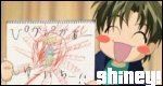
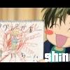
[color=teal]*Mod-approved double post. Spam post has been deleted above. -Syk3[/color] Since the last paper I had failed to draw in a comment, I changed it. :( :( :( This one is of Sesshy form InuYasha. I took an already existing paper that I got off of the interent and added Sesshy on to it. I like it. Tell me if you do. ~Haze
-
nice work. Don't mean to sound mean about this. The first banner: This one is slightly dark looking. Perhaps you could lighten it up in some way? I dunno. I like how the slash that Sesshomaru makes continues throughout the entire banner. The picture is indeed a wee bit pixelly, but not so much so that it takes all that much away from the banner. Behind your text. . . there is something funky going on. It's like fuzzy and stuff. Kind of weird. And yes, I would change teh font. It doesn't go. YOU NEED A BORDER! ^^ borders are your friend. Use them. The second one. Anh, it is alright. This picture is even worse than the one before it. It is highly blurry. ANd blurry isn't good. I like the background. Were you going for a background that made it look like he was rushing by so all of the background was blurred behind him? Don't know if that makes sense, but hey, it did in my head. I don't really like that quote with that picture. It doesn't really go well. And as long as we speak of not going, the font doesn't either. Once again. . . BORDER! Borders are automatic elegance. El numero 3: *crinkles up nose* I don't believe I like this one all that much. I will start with the most obvious stuff. THe background. You can see squares in it. it's like you took part of a picture and stretched it that big to be your background. I think something more simple and less blue would have been better here. Next I will move onto the text. I'm assuming that the foggy stuff coming from his hand is the poison on the picture? If so, that would make more sense with the quote. The font is horrible. It doesn't do the banner justice. You need something more showy. Now for the actual picture. This one's quality is by far the worst out of the three. You can't even make out his facial features. I could only tell it was Sesshomaru by his clothes. Number four: This one is probably the best out of all of them. THe picture is clear and pretty. For some reason all across the banner is slightly blurry. *shrugs* It is weird. The background looks like it was stretched. It has lines running through it. Very nice overall though. I don't suppose teh text goes very well. perhaps if you moved it over and down. Where it is about on the same level as her chin and about a half of a centimeter or a whole one right off of the right side. and I bet you know what I will say next. What does it need? A BORDER! you are sooo good at guessing that. ^^ Those are my 2, no wait. . . . . *begins counting numbers of advice*. . . whatever. those are my cents that I put in. Hope you use them. I think once you improve a bit you will become an excellent banner maker. ~Haze
-
Oh my! That is great PT. I keep laughing every time I think about it. I especially like the addition of the Queen song onn the post. ^^ The banner really looks good. The fonts are clean, and the colors are pretty. Simple and clean. Very cool. Now did you really ban Bloodsin? Or was he even a real member? I really like Charles' screen name. ^^ Nice Job on yet another hilarious banner. ~Haze
-
Writing Today's Poem [M -- As a Precaution]
Haze replied to Heaven's Cloud's topic in Creative Works
I'm sorry guys but I don't have a poem to post. I just wanted to make a comment for Mitch. Your poem "Fog" is probably the most beautiful thing I have ever read. Honestly. It almost made me cry. Don't know why other than the shear beauty of it. Thank you for posting it. ^^ ~Haze -
heh. That is the best. I love the shades picture! I really like the background. Goes well with his face. I think. . . . . anyways. I like the Shippo one too. It is soooo cute! I miss Kareoke Kenshin though. *sniffle* ^__^ Very nice work. The backgrounds are fun and moving. They go very well with the pictures you use. ~Haze P.S. As a Paint Shop Pro user I can honestly say that I have never used either of those effects. Don't know why though. I guess I have never thought of it. heh.