JamesMay
-
Posts
70 -
Joined
-
Last visited
Content Type
Profiles
Forums
Calendar
Everything posted by JamesMay
-
Today is a great day. I recently moved to LA from Arizona. I try to stay in contact with all of my old friends but it can be hard at times. I just got a package from one of my good bros in AZ. He got me Mugen's sword from samurai champloo for christmas!!! I am sooo stoked.
-
The villain I cant help but like is Char Aznable. He is extremely level headed and fair. He has honor and shows respect to everyone. Although he is portrayed as a villain, I feel his views (zeon) aren't wrong, just different.
-
I havent written in legit cursive since I was 9 years old.. hahahaha.. I suppose my signature is psuedo-cursive. Basically a big fancy "J" with some scribbles after it. lol
-
I was wondering if anyone on this forum builds gundam models? (or any other mecha) Ive been doing it for just about 2 years... If anyone does build gunpla, please let us know what kits you have and post some pics. My current collection: High Grade: GP02A Hazel Custom Unicorn Destroy Mode Char's Gelgoog 0 Gundam Gaddess Green Tokyo RX78-2 Infinite Justice Master Grade: Blue Frame Astray 2nd Revise Exia Z'Gok Gouf 2.0 Perfect Grade: 00 Raiser Other: Super Deformed Zaku III Gashapon Tieren MSIA Freedom Gundam Action Figure Gashapon Unicorn No Grade Evangelion 01 Rebuild Im not going to post pics of ALL of my kits, but here are a few. This is the flagship of my collection. Perfect Grade 00 Raiser. I purchased this kit in Tokyo last time I was there. Heres a pic of 00 gundam with half of the inner frame exposed. [img]http://i230.photobucket.com/albums/ee135/jamesfrankmay/00GoldDetailsandDecals.jpg[/img] Heres a pic of Master Grade Blue Frame Astray and High Grade Unicorn Destroy Mode. [img]http://i230.photobucket.com/albums/ee135/jamesfrankmay/UnicornAstray1.jpg[/img] Ive only done [u]full[/u] paintjobs on some of my kits.. For the most part I just panel line them, hand paint small details, and apply dry transfer decals.
-
that looks beast.. it flows now
-
Personal preference... when an image has lighter colors and tones around the edges I personally believe a black border is necessary. It would also help tie in the black edges and eyes of the render. it would also look nice if you cropped out some the left edge of the picture, making the flowing hair and text closer to the left. And maybe size the whole signature down a bit. The aesthetics of the image are very nice and cheery though.
-
that looks wicked
-
I need to get my sleep schedule turned around for christmas!... been sleeping from 8am - 5pm :/
-
lookin good... the only thing I dont like is when your name is crammed in the corner.. it would look sweet if you put it either just above or just below the word [u]smile[/u] and offset it towards the left or right.
-
[quote name='SarahPatricia' timestamp='1292938939' post='703069'] Hmm, for your last sig, the text seems to be a little too big. Maybe you could try to make it smaller. The focus on this one seems good. But the render looks a little low quality. I like the "under-water" feel of it. Or wait, is that supposed to be outer-space? ?_? [/quote] either or.. haha.. most likely outer space though.. I wanted to have huge text on this one xD
-
Im happy with asuka's hair now.. its not as jaggy, but the lines are still visible.. i kind of like them now : ) this is the last one im making tonight... did a quick simple chibi exia. [img]http://i230.photobucket.com/albums/ee135/jamesfrankmay/SDgundamsig.jpg[/img]
-
Changed the coloring and lowered the opacity of the text on the unicorn sig [img]http://i230.photobucket.com/albums/ee135/jamesfrankmay/coolsiggundam5.jpg[/img] Blurred Asuka's hair. [img]http://i230.photobucket.com/albums/ee135/jamesfrankmay/asukasig3.jpg[/img]
-
[quote name='CaNz' timestamp='1292933647' post='703056'] the colors seem to match her eyes more than anything else...which is kinda cool... but my main issue is the girls hair has giant jagged edges were the hair flows into the background... blur is your friend. as for opacity issues, you can see were some stuff got discolored. when this happens to me I do one of two things: 1, alter the opacity in sections, the spots where the discolorations happens can be made more solid (also photoshop lets you alter the fill of the layer. you can sometimes use that instead of opacity, giving different effects) 2, alter the background. offen these discolorations occur from certain anomalies in the background, and you can get rid of them by taking a color that works, and replacing it with the one that does not work. or the third thing is just leave it... some spots don't look all that bad, and with editing I always say that you are never finished, you are just close enough. (you can always find something to make a little better, but you can ask yourself if you need to or not... if it looks good and you like it... you made it close enough) [/quote] Im going with the 3rd option! Im an audio engineer and musician. I find myself tweaking my mixes for weeks and even months at a time. Sometimes its best to just move on to the next project. I really appreciate everyones comments and suggestions. Im doing this as a fun little hobby to kill time over winter break. Im not too concerned over the minuscule details. "if it looks good and you like it... you made it close enough", is definetly my motto for this little project.
-
[quote name='SarahPatricia' timestamp='1292932420' post='703052'] Your trademark looks good. I wish I had one xD I like the text on the 1st, 3rd, and 4th. Then 2nd one didn't really fit. Try changing the color or the blending mode or maybe the opacity a bit ^_^ Is the 4th one a new sig? It looks kinda..... well the render didn't fit. Maybe because there are still black lines from the rendering. Or did you do that on purpose? And again, the focal point. The white thing looks a little too bright. And the colors don't compliment each other. I do love the text in it :3 [/quote] text on the unicorn gundam sig gave me a headache. I tried to blend it in better but it became illegible. Finding that balance is very hard. The asuka sigs render had the black lines on it originally.. I would prefer if it didnt have them, but im not pro enough to remove them.
-
Im a huge fan of email.. all of my bros are facebookers and hate email, so I make sure to send them TONS of uber long emails just to tick em off.. haha The only time I write with my hands is in class taking notes. But even now my instructors are starting to hand out PDF files to the class instead of old fashioned lectures/writing. (we even take our tests on our laptops over the network now) Its obvious that hand writing is dying. Its a shame. Mainly due to the fact that pens and pencils are cool! (ive been told I have an office supply obsession : / ) Also think about other languages calligraphy. It will be horrible when the Japanese forget how to hand write kanji. Communication with the written word will live on in some way or another.. but the art of calligraphy has been dying for a while!! Think about what peoples handwriting looked like in the 1700's? Comparing that to the average modern persons handwriting is a joke.
-
[quote name='CaNz' timestamp='1292929498' post='703042'] tis the beauty of art my friend. [/quote] [quote name='SarahPatricia' timestamp='1292930352' post='703047'] James: Soz. XDDD Well we do have different tastes xD [/quote] hehehe... Exactly!! Beauty is in the eye of the beholder. Ok.. I think I figured out my trademark. The cross JamesFM logo and black cinematic borders. [img]http://i230.photobucket.com/albums/ee135/jamesfrankmay/wolfwoodsig3.jpg[/img] [img]http://i230.photobucket.com/albums/ee135/jamesfrankmay/coolsiggundam4.jpg[/img] [img]http://i230.photobucket.com/albums/ee135/jamesfrankmay/ChipSig3.jpg[/img] [img]http://i230.photobucket.com/albums/ee135/jamesfrankmay/asukasig2.jpg[/img]
-
[quote name='SarahPatricia' timestamp='1292927719' post='703038'] The text looks good. Try to brighten up the focal a little though. And just a suggestion, why not try to sharpen the whole thing a little? Just a little bit ^_^ And I'm not feeling the empty space there. And I dunno, the border looks a little too thin IMO. [/quote] lol... you dislike EXACTLY what I was going for.. hahaha.. dark and soft with a big void. xD
-
[quote name='Kre' timestamp='1292909124' post='703025'] Yeah, like everyone else has said, you have a good start. CS3 is a good tool, and has a wide array of things you can use and get good at using to create some fancy effects. It seems you've used some brushing and smudging stuff, and I'll admit I didn't look too closely at either of your works, but have you considered using any C4D's to add any effects? Text is another thing entirely like Boo said. Text can be very difficult to do well, and I myself have only recently gotten 'decent' at it, but I'm still not that great at adding text. The main thing, like others have said or implied, is to make it blend with your background, obviously not so much that it can't be seen, but enough so it doesn't distract from the focal. That's the challenge, in my opinion :P There's layer effects, but I'll sometimes mess around with smudging just the edges of text so it blends slightly, or doing like a clipping mask like my current sig. Just experiment and have fun with it, and tutorials are a great resource to be used, so keep hitting them up as well. [/quote] I used about 6 or 7 c4d renders in each one of those sigs... I just made them very subtle. the only brushes i used were to create the dots and lighting effects. Then next one i make i will try to make the c4d's more obvious as well as add text. [b]UPDATE[/b] Okay... Here is my attempt at some basic text.. My name is James Frank May so the "FM" stands for my middle and last initials. I also whored 23498098234 C4D's in this pic. They are not so subtle this time : ) Its my 2nd favorite GG character, Chip! (1st being Sol... but this render was too sick not to use.) [img]http://i230.photobucket.com/albums/ee135/jamesfrankmay/ChipSig1.jpg?t=1292924403[/img]
-
i hear ya.. im a total text noob. I need to watch some tutorials for uber leetsauce text.
-
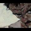
[quote name='Boo' timestamp='1292852196' post='702994'] Hm, unlike CaNz, I like the thick borders giving a cinematic effect to it. SarahPatricia was pretty spot on about the focus of the banner, but I have to say that for a first shot this is pretty ace. The picture you used for the banner is top quality, the lens effect works well and the overall feel of it is pretty much "I'm epicly awesome". I'd recommend putting the other shoulder more in view, which in effect will put the head in focus more. Also, some kind of text would be schweet. Quotes and names mostly work well enough for forum banners. :V [/quote] I originally wanted to use some text but it ended up just looking goofy.. I will use text on some future banners with more "sparse" layouts. Also, the other shoulder isnt visible in that particular render. Plus i like the off center feel.
-
Good call on the borders... I made them a bit smaller. I also made a new sig last night. My favorite Trigun character, Wolfwood! [img]http://i230.photobucket.com/albums/ee135/jamesfrankmay/wolfwoodsig.jpg[/img] Im using PS CS3 btw
-
[quote name='SarahPatricia' timestamp='1292812634' post='702974'] I'm not a pro and all but can I comment on your work? I believe that the focal is the face, right? The little pink thing seems a little too bright. It would lead the eyes towards it instead of the focal. Maybe you could add some lighting in the face to just make that equally bright. Or maybe you could lessen the brightness of the pink thing. The flow is a little off. But it looks really good for a first try. [/quote] good call.. im not going to change that one but I will try to implore that technique on my next one.. the pink thing on his shoulder ended up becoming the focal point when it should have been the face.
-
[quote name='AvalonAngel' timestamp='1292774186' post='702962'] [font="Tahoma"]Didn't stop Al-Qaeda, m'boy I'm sure terrorist organizations and other dissidents are perfectly aware of the capabilities of our countries' military. As would be any other first world countries with Nuclear Arms. The threat of retaliation didn't mean anything at Pearl Harbor, and that was before nuclear weapons. So what changed besides a better bomb? [/font] [/quote] The key is "less likely". War will always be present in this world.
-
I decided today that I want to learn how to make uber 1337 sigs.. Im going to watch youtube tutorials and see if I can eventually make something cool... I AM NOT A GRAPHIC DESGNER / VISUAL ARTIST. (im a musician which makes me an artist in a different respect) Heres my first try... [img]http://i230.photobucket.com/albums/ee135/jamesfrankmay/epicunicornsig.jpg[/img] I will post pics of new signatures I make over time. If any of you are pro graphic designers and have cool tips/tricks I would GREATLY appreciate it.
-
http://www.youtube.com/watch?v=MAXgjsF895c&feature=related Rage uses the new IDSoft engine correct?