
Arkadyz
-
Posts
393 -
Joined
-
Last visited
Content Type
Profiles
Forums
Calendar
Everything posted by Arkadyz
-
[color=orangered][font=times new roman]Very cute mystikal...Ill agree the right hand is alittle off...But thats alright it still looks great as always...All you need to do now is post a pic of yourself so we can compare how accurate your portrait is :D On a completely unrelated note...This pic has to be one of the most [b]BEAUTIFUL[/b] drawings ive ever seen... :eek: Def has to be my fav drawing of yours...***points to attachment*** :cool: Just had to say that :p [/color][/font]
-
[color=orangered][font=times new roman]Well I saw it last week...It was alright nothing more then popcorn fun fare and thats about it... It was fun to see arnold kick some butt again :p And T-X was luciously evil... My favorite part had to be the whole crane chase scene...I mean talk about needless destruction :D Im actually looking forward to there being a fourth film...I wanna see the war between man and machines damnit :D Just the thought of thousands of exo skeletons and H-Ks fighting the human army...ohhh.... :devil: [/color][/font]
-
[color=orangered][font=times new roman]Wow I really like the tsukasa banner...The whole multi colored background thing looks real sharp :D [/color][/font]
-
[color=orangered][font=times new roman]Heh well I love it except no text... :p Not enough people use green so I like that you used that color so much in the banner...And the pic you used looks nice...Just needs some text :D [/color][/font]
-
[color=orangered][font=times new roman]Well the series grows on you...I was kinda thrown off by the old animation but the storylines make up for it... I really like goemon(sp?) Hes just a fun cool character...Fav scene with him had to be when he was playing the slot machines and getting all ticked off...heh :D But yeah its a really fun series...[/color][/font]
-
 [color=orangered][font=times new roman]Ugh flirtatious girls make my brain hurt...Like this one at work...She flirted with me alot when she first started working there so I asked her out...Well she turned me down...And now a few months later shes back to flirting again even MORE then she was before... Its enough to make ones brain explode...ugh :worried: So even if you just go the straight route and ask them your still left confused sometimes... :wigout: [/color][/font]
 -
[color=orangered][font=times new roman]Wow syk...Another amazing banner from you... While ill agree that the character isnt that appealing looking thats not your fault :D The gundam in the background looks really good though...Its a shame you dont make more banners and such anymore syk...Comeon we wanna see more... Dont make me beg :p [/color][/font]
-
[color=orangered][font=times new roman]Oh wow kaola...You really found a [b]very[/b] cute and high quality pic to use for a banner... I actually think it looks fine as is...If you really do want to put some text id just put your name or something...But its a very beautiful banner :D [/color][/font]
-
[color=orangered][font=times new roman]Good lord mystikal...You can do no wrong... :p I actually dont mind the skeleton cause it looks like an anime skeleton...Its not suppose to look realistic... The tree looks great and the character design is amazing...The bluebird is nice looking and the pendant around here neck also... This is one of my favs of yours definatly...:cool: You are one of the best if not [b]THE[/b] best artist ive seen...very nice :D [/color][/font]
-
[color=orangered][font=times new roman]Wow im sorry I dont know how I missed this one and didnt comment...The first one looks amazing...very clean and high quality looking... I really like the faye one too...Cutting up banners is always fun :D [/color][/font]
-
[color=orangered][font=times new roman]Sweet banners stuart...Now lets get to ratings I suppose... [b]First Naru[/b]...8/10...The border is abit too thick and the naru pic in the forefront is abit fuzzy...But the background looks great... [b]Second Naru[/b]...9/10...I really like this one...The pic looks more crisp and the little cutoff thing with name is nice... [b]The majin buu[/b]...w/o the animation is ok looking...WITH nomads animation it looks awesome...id have to give it a 10/10 And lastly the [b]love hina one[/b]...9/10...I lovethe effect on the bottom half...And that cool tiled effect on the top half...Only problem is the lack of text... So inshort amazing banner...Get yourself some good text and you'll be cranking out 10/10 banners im sure :D [/color][/font]
-
Location, location, location--Where are you from?
Arkadyz replied to Baron Samedi's topic in General Discussion
[color=orangered][font=times new roman]Hmmm well im currently living in SouthEast Florida...Its alright down here... Ive lived all up and down the eastern seaboard...Fav places have to be Baltimore, South Carolina, and living on the ches' bay in virgina... Man seems like we have alot of texans and Aussies...You all really should have a get-together...I wanna see pics :p [/color][/font] -
[color=orangered][font=times new roman]thats very good stuart...And I dont mean for a first try :p syk pretty much hit the nail on the head...The banner looks great (ofcourse im a tifa fan so im abit bias... :cool: ) The scanlines look good...Sometimes they can look horrid but there just transparent enough not to mess up the image but you can see them clearly enough that they give the banner that little extra spice...:D [/color][/font]
-
[color=orangered][font=times new roman]I love your new av DD...Its kinda looks like a dragon or a bat...Freaky cool :p And theres nothing wrong with black and white...Everyone has there thing this is his :D [/color][/font]
-
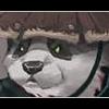
[color=orangered][font=times new roman]Awww...How cute is that little panda...hehe sooo adorable... Very nice banner/avatar mei :D [/color][/font]
-
Art The path to insanity... Enter the Matrix o0
Arkadyz replied to DarK DeatH's topic in Creative Works
[color=orangered][font=times new roman]all I can say is...HOLY CRAP...That person has some serious time on there hands...I have never seen anything that freaky cool ever...wow...just...wow... :wigout: [/color][/font] -
[color=orangered][font=times new roman]Well as has been said before her feet and head are slightly askew...But its still a VERY good piece of art...Your cging skills remain perfect... Even your screw ups look incredible :laugh: The thing that was most off for me was actually the background...I dunno an angel in such a domestic normal setting is alittle off to me...But im cooky like that :p But its still a beautiful drawing :D [/color][/font]
-
[color=orangered][font=times new roman]Ahhhh theres more after the credits? Bloody hell why didnt any of the reviews I read tell you to stay after the creds to see that... Sighz oh well...Maybe if I see it again ill stay until after the credits :D I would hope the next one though didnt involve the same curse again ya know...That would be alittle too repetitive... :rolleyes: [/color][/font]
-
[color=orangered][font=times new roman]Well lemme see...Umm for mecha designs I love Unit-01's design and color scheme...Big O has a fantastic looking old school design...The GP-03 would have to be my fav gundam...The thing is huge and has insane firepower...That or the Kampfer...It gets the crap beat out of it but its still one of the sweetest looking mech in the gundam universe... As for pilots I have a soft spot for asuka...She has such a truely excellent character design...Not a huge fan of her mech though :p [/color][/font]
-
[color=orangered][font=times new roman]Wow I really like the red one...While im no fan of smoking it still does look good and the background effect is real cool... Oh and I decided to use your excellent Asuka banner...Even found myself a good avatar to use with it :D [/color][/font]
-
[color=orangered][font=times new roman]Thats a pretty sweet animated banner...Your friend def has some skillz...Sometimes animated banners can look so-so but thats great looking :D [/color][/font]
-
[color=orangered][font=times new roman]Yeah HC thats what I basically said in the last thread that ppl where asking about a new series...People seem to confuse the renewal of eva project with a new eva series...All it is gonna be is a remastering of the original series... On another note I read somewhere that ADV has plans to rerelease the final 2 DVDs with "directors cut" additional materials...I cant remember where I read that at but ill be the first to buy em :D Could be wrong though...I gotta find where I read that at before... :rolleyes: And just cause something looks high quality doesnt mean it isnt still fan art...I mean that one guy made "voices of a distant star" All by himself on his freaking mac for godsake :D Fanart can look just as good as pro sometimes...[/color][/font]
-
[color=skyblue][font=times new roman]Thats nice logan...The animation was done good and I like all the avs of are OB members... :p [/color][/font]
-
[color=skyblue][font=times new roman]very lovely elegant and ethereal(SP?) The white blends with the blue very nicely without blending too much as to the point where its hard to read...[/color][/font]
-
[color=skyblue][font=times new roman]Oh wow Majin...Thats really great... ***saves for possible use later*** :D I love the font you used and the overall look of the banner...small elegant...And very fitting of the characters true feelings :cool: [/color][/font]